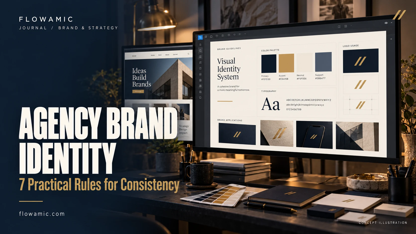
Agency brand identity becomes useful when it works across the website, portfolio, team information and everyday client communication. A logo is one part of that system. Flowamic’s own studio project combines a geometric F mark with gold, midnight navy and ivory, then applies that direction to services, selected work and contact pathways. It is an in-house example of a connected brand and website experience.
THE PRACTICAL TAKEAWAY
Your agency brand is also the way your services, portfolio and next steps fit together.
1. Define the promise in plain words
Write a short description of what the agency does and who it helps. Use that description to guide the website introduction, service labels and LinkedIn page.
Avoid a statement broad enough to fit any business. The brand should help a prospective partner recognise relevant capabilities, whether they need website development, video editing or a clearly scoped digital project.
2. Establish a restrained colour system
Define primary backgrounds, text colours and accent use. Flowamic’s palette uses midnight navy for depth, ivory for readable space and gold for emphasis.
Check contrast in the actual component rather than assuming that a palette works in every combination. A gold button may need dark text and a dark mark to remain legible. Consistency includes these practical exceptions.
3. Give the logo usable variants
A mark that works on a dark header may disappear on a lighter background. Prepare variants for the contexts the business actually uses, including the website header and LinkedIn avatar.
Preserve the proportions and clear space. Use vector artwork where suitable so the geometry remains sharp at different sizes. The goal is recognisability across real placements, not an elaborate set of unused mockups.
4. Related work: Flowamic’s studio website
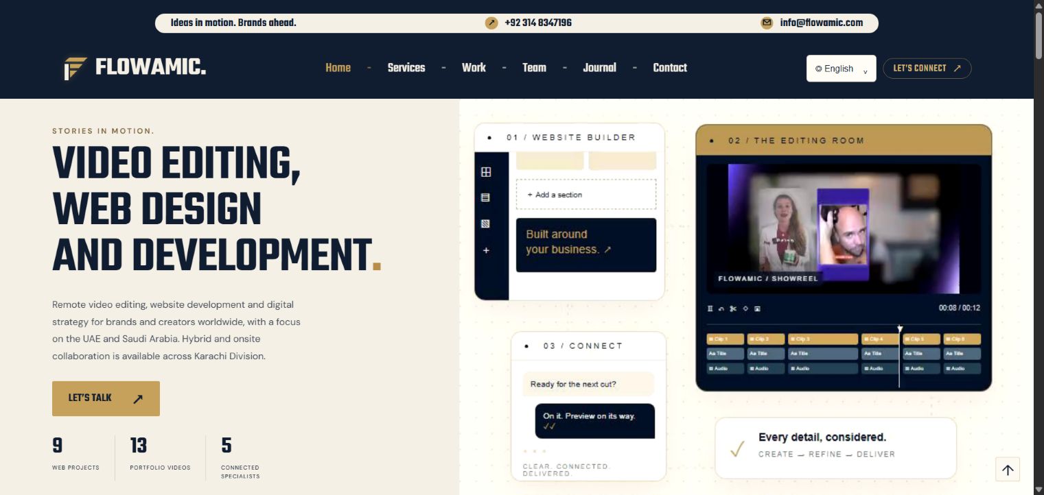
The Flowamic portfolio project brings agency identity, services, people, work and contact information into one presentation. Its actual screenshot shows how the brand direction appears in a real page.
This is our own studio project, not a third-party client campaign. The example demonstrates visual application and information structure without claiming a measured increase in leads or brand awareness.
5. Make content part of the identity
Choose a writing style that explains the work clearly. Service pages should say what is included; portfolio pages should distinguish live projects, local previews and independent concepts.
Use consistent team names and approved contact information. Brand trust is affected by these details as much as by colour. A polished visual system cannot compensate for contradictory project descriptions.
6. Connect the website and LinkedIn
Use the same agency name, mark and service language on both channels. Blog articles can direct readers to the company’s LinkedIn presence, while LinkedIn posts should point to a specific article that expands the topic.
A useful link gives the reader a reason to continue. Consistent campaign tags can help identify incoming visits without changing the canonical URL of the article.
7. Maintain a practical brand guide
Record colours, logo variants, typography choices and a few examples of their correct use. Keep the guide close to the files the team needs.
Review new pages against it before release. Agency brand identity becomes easier to maintain when it is expressed as clear decisions that a developer, editor or sales colleague can apply during everyday work.
Common questions
Is this an external client case study?
No. Flowamic’s brand and website are an in-house studio project.
Should the brand look identical on every surface?
It should feel consistent, while adapting to the size, background and purpose of each placement. Legibility and usability remain essential.
FROM READING TO A REAL BRIEF
Your agency brand identity project brief
Tell us what you need to publish or build, who it is for and which parts already exist. For an agency partnership, include the client context you can share, the required deliverables and the approval process.
- Define the primary audience and one useful outcome.
- List available assets, content and any access requirements.
- Set a target deadline, budget range and feedback owner.
- Agree scope, acceptance checks and handover before production.
We can discuss a focused paid pilot before a wider engagement. Scope, timing and pricing are agreed after reviewing the brief.
Discuss your project ↗Explore this service ↗CONTINUE ON LINKEDIN
A practical conversation, beyond the page
Follow Flowamic on LinkedIn for service notes, portfolio updates and conversations about agency delivery.
Visit Flowamic on LinkedIn ↗